Why do people make bad slides?
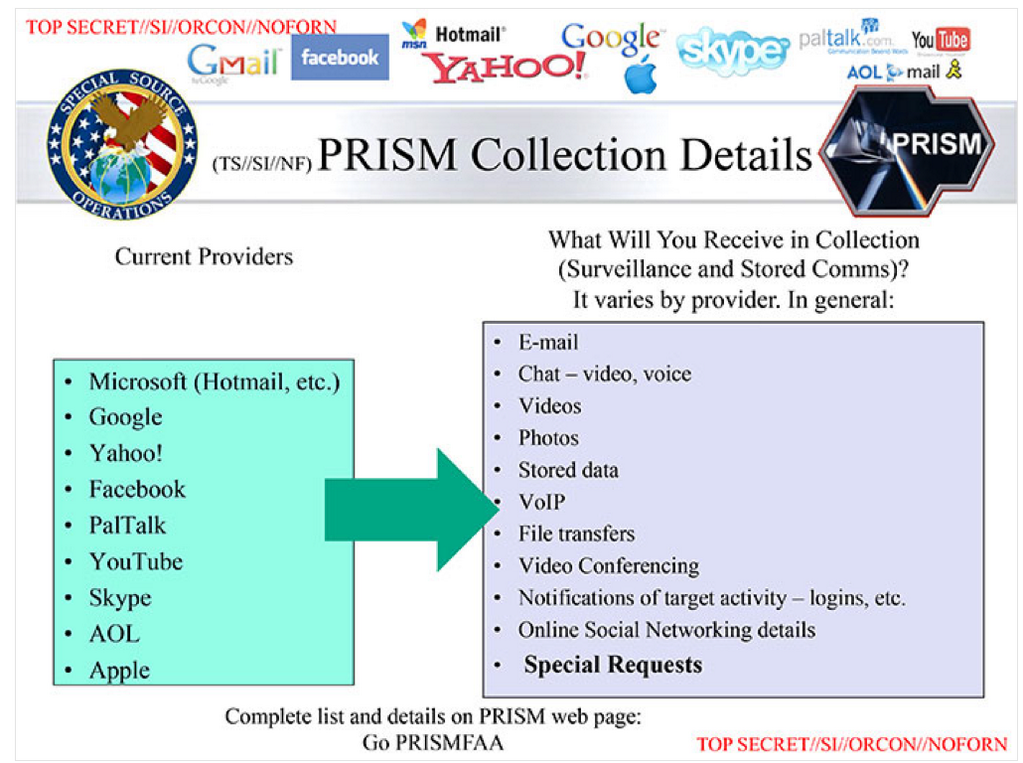
For years experts in psychology, design and even technology have decried Powerpoint and its many evils. Every few months another blog post, or presenter, explains in detailed outrage why the a presentation they saw was a a horror show of bulleted lists, overwrought diagrams and ancient templates (including this recent story NSA/Prism story).
So why then are bad slides so popular?
- Bad slides are less work. Nearly everything in the world we know to be stupid is easier to do than the right thing. Ignorance is often less of an issue that the lack of interest in doing the extra work to be better. For unpleasant things, most people, most of the time, are happy to do just enough not to be horrible, and move on.
- The slide is used for more than the presentation alone. Garr Reynold’s calls this a slideument, a reference to how the slide deck is expected to function without the speaker, sent around in emails. In large bureaucracies is common for the slide deck to be circulated before, and after, the presentation itself.
- Organizational tradition demands bad slides. If most people at an event do the same old boring, hard to understand, ugly distracting template, bulleted list wall of death, to do the right thing requires standing out and taking a risk, something most speakers do not want to do. They want to fit in and take few risks. The rule makers are often those most out of touch with what good presentations, and their slides, should be like.
- It makes it look like you’ve done tons of work. To the average eye, a dense, heavy, slide deck looks like more work has been done that the refined, clear, clean slides heralded by the best speakers. It’s a fast way to make it appear that you’ve done much work, when in reality a simple, clear, concise slide deck requires much more work. People are often impressed, at least at first, by volume, rather than quality.
- They really don’t know there’s an alternative. Some people don’t get out much. They don’t see many presentations. Even if they’ve seen a TED talk online they don’t make the connection that what they do in their workplace can borrow some of those choices. So when it’s their turn they pull up an average of all the ones they’ve seen and try to use their presentation software, tools that promote bullet lists above all else, to approximate it.
- They’re asked for bad slides. Some event organizers ask to review slides, as if that’s a good quality control measure. When handed a slide deck of 15 pictures, they have no idea what the speaker is going to talk about, and this makes them nervous. It’s not uncommon for speakers with slides that follow Garr Reynold’s advice to get feedback that make their slides worse.
- Speakers use slides as their own notes. Slides should be for the audience, not the speaker. But many speakers destroy their slides by cramming back-up information that would only be used by the speaker. It’s ok to leave cues for yourself in slides, but they must be minimal enough they don’t ruin the audiences experience.
I’m convinced there will always be bad slides. There will always be ugly, bullet laden slide decks, or Powerpoint abused visuals, filled with text and diagrams few will read much less understand. Until conference organizers, professors, and bosses explicitly encourage a new, improved style of communication, we’ll be living with these complaints for a long time.
I deliberately didn’t spend much time in my book Confessions of a Public Speaker on slide design, since if you plan a talk properly you focus on slides last, and they come out simpler and better since they’re never the focus. And of course Presentation Zen and Slide:ology do a good job of explaining slide design craft.
Chris Atherton‘s excellent presentation at TCUK09 details the cognitive psychology of good slides – why aren’t these concepts and research more well known?
What do you think needs to happen to help presentations, and slides, evolve?
[Note: post updated 6/6/2013]