How to show time during a presentation
João Adolfo Lutz asked me recently about noting time progressed / remaining in slides:
I’d like to know what do you think about printing kind of a “timeline” in the slides, lightening the topic that is being shown at the particularly moment. One teacher of mine says it’s very important for the crowd to know WHERE they are in the presentation, but none of the writers i read about (Nancy Duarte and Garr Reynolds) spoke about this particular topic.
The short answer is no. A good speaker shouldn’t need them.
Here are five ways to solve this problem. One good, four questionable.
1. The speaker marks time.
Time is important. There is a entire chapter on managing time in Confessions of a Public Speaker. However it doesn’t have to be in the slides themselves. A good speaker can remind the audience, in passing, when they are 1/3rd and 2/3rds of the way through their presentation. This implicit way is simple and easy.
However, I’ve experimented with different time marker techniques, mostly for Ignite, as the spirit of the format is that you do everything in 15 second units. I think explicitly putting time markers in slides can work if done with care. It’s all too easy to make it a distraction.
2. Gentle boxes – I divided the screen into 20 boxes, each box representing 1/20th of my total time. Each box slowly faded in. The light blue boxes represented 1/5th of the total time. I used no actual slides for the talk itself.

3. Progress bar – many people have done this. For my ignite talk on how to write 1000 words, we made a small progress bar on the bottom of the video, marking time. Its subtle enough not to be a distraction from the main event.

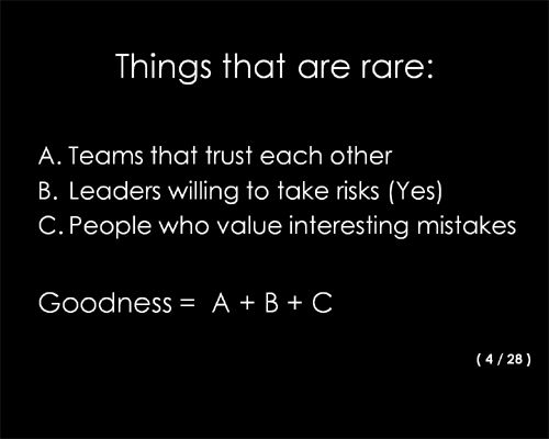
4. Numbers – The simplest way to go is to simply number slides, putting 4/28 in the lower right corner to indicate the 4th slide of 28. Three problems. First, a slide is not a measure of time. Second small text (e.g. subtle) is hard to read, and defeats the purpose of being a gentle reminder. Third, unless you have a slide footer, a number floating in space is a visual turd – it spoils basic composition.

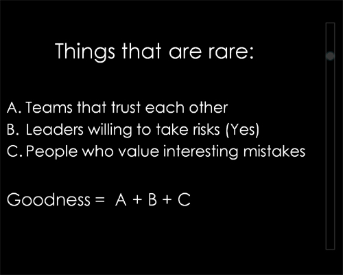
5. Vertical bar – I’ve never done this, but I’ve seen it (picture is a quick mockup). You put a visual indicator on the right most part of a slide, that moves down vertically for each slide. This is easier to do in a subtle fashion than numbers, but has the same problem of slides != time, and it has to walk the fine line of being visible, but not distracting. It also causes composition problems.

Summary
Keep it simple. Practice enough to know your basic timings. Then the timeline comes through naturally in the lecture, or because you mention to the crowd when you are 1/3 and 2/3rds done. It’s less work and a better experience.
Have you seen other ways to mark time? I’d love to know about them – please leave a comment.
